Moctah: A Bold Retro Serif Font for Digital Branding
I was deep in the final round of a boutique coaching site redesign—hero section open, two typefaces loaded, and that familiar pause before committing to a headline font. The client wanted “warm but confident, nostalgic but current.” I dropped Moctah into the H1 tag, adjusted line height, and instantly felt the layout exhale. That’s when I knew: this wasn’t just another retro serif—it was a rhythm-maker.
A Typeface That Anchors With Personality
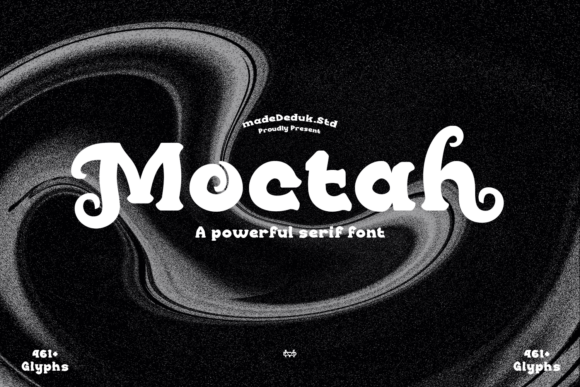
Moctah is a bold serif font with unmistakable 90s retro charm—think subtle flares on the uppercase ‘T’, generous x-height, and a grounded, slightly condensed stance that commands attention without shouting. It’s not distressed or grungy; it’s refined vintage. As a display font, Moctah thrives where personality meets clarity: hero headlines, section dividers, call-to-action buttons, and logo lockups. Its serifs are strong but friendly, its contrast balanced—not too stark, not too soft—so it holds up beautifully across devices and screen sizes.
How It Performed in Real Web Layouts
I tested Moctah across five key digital touchpoints:
- Landing page hero: Paired with a clean sans serif (Inter, set at 400 weight) for body copy, Moctah at 48px on desktop and 36px on mobile created instant hierarchy—and surprisingly smooth readability, even over semi-transparent image overlays.
- Product feature cards: Used Moctah for card titles only (not descriptions). Its bold weight gave each card visual weight while keeping scannability high—no squinting, no hesitation.
- CTA buttons: At 18px with tight letter-spacing, Moctah added tactile confidence to primary buttons. Not overly decorative, but distinct enough to stand out from default system fonts.
- Blog headers: On article preview cards and post titles, Moctah brought editorial warmth—ideal for creative brands, wellness spaces, or small-batch product stories.
- Mobile navigation toggle: Here, I scaled back. Moctah isn’t ideal for tiny UI labels or dense menu items—its character density works best above 16px. For nav links, I switched to the same sans serif used in body text.
Readability & Responsiveness: What Works (and What Doesn’t)
Moctah shines in short-form, high-impact contexts. It’s built for moments where you want users to pause, recognize tone, and feel aligned with your brand voice—not for long paragraphs or functional interface text. In testing, it maintained excellent legibility down to 24px on desktop and 20px on tablet—but below 18px, especially on lower-DPI screens, the fine serifs began to soften, reducing contrast.
On dark backgrounds? Moctah holds up well—its sturdy stroke weight prevents “bleeding,” and the consistent spacing keeps letters distinct. Over photos? Use a subtle text shadow or background tint for safety. For accessibility, always pair it with a highly legible, WCAG-compliant sans serif for body content, alt text, form fields, and navigation.
One practical note: Moctah’s rhythm comes from intentional spacing—not automatic kerning. When using it in dynamic CMS headers or variable-length buttons, test edge cases (e.g., “YES” vs. “WORKSHOP”). Some letter combinations benefit from manual tracking adjustments in CSS or design tools.
Smart Pairings for Cohesive Digital Identity
Moctah doesn’t need competition—it needs context. I consistently paired it with a neutral, highly readable sans serif like Inter, Poppins, or Manrope for body text, captions, and UI elements. That contrast—bold serif + airy sans—creates breathing room and reinforces professionalism. For more editorial sites (like a creative blog or portfolio), I tried pairing Moctah with a gentle, low-contrast serif like Lora for subheads—surprisingly elegant, though less versatile across breakpoints.
Avoid pairing Moctah with other decorative fonts (scripts, exaggerated displays, or ultra-thin serifs)—it’s confident enough to carry the spotlight alone. And while it *can* work in logo text (especially for wordmarks under four words), avoid stretching or condensing the font—it’s designed to breathe at its natural proportions.
What You’ll Want to Check Before Launch
Before dropping Moctah into a live project, verify a few practical details:
- Webfont formats: Confirm the license includes WOFF2 (for modern browsers) and fallback WOFF support. Self-hosting gives you full control over loading performance.
- Weights & styles: Moctah is primarily a display font—most versions include one bold weight with optional alternates or ligatures. Don’t expect Light, Medium, or Italic variants unless explicitly listed.
- Licensing: Ensure commercial web use is covered—especially if embedding in client sites, SaaS dashboards, or digital product templates. Some licenses restrict usage in editable web builders or hosted platforms.
- Multilingual support: If your audience includes extended Latin characters (accents, diacritics), check glyph coverage. Moctah handles basic Western European languages well, but verify for Cyrillic or extended punctuation if needed.
- Load strategy: Because it’s a single-weight display font, Moctah loads quickly—but still consider
font-display: swapto avoid invisible text during render.
Moctah won’t solve every typography challenge—but when you need a bold, memorable, human-centered voice for your digital brand, it delivers with quiet confidence. It’s the kind of serif font that feels intentional, not inherited; warm, not dated; distinctive, not distracting. In a landscape full of safe choices, Moctah reminds us that great web typography starts with feeling—then follows through with function.